Bud 66
Packaging Redesign
The only thing that is constant is change, and these times prove this. Young consumers always adapt to trends without loosing their essence. That's why the most chosen beer in Paraguay needed to refresh its image.
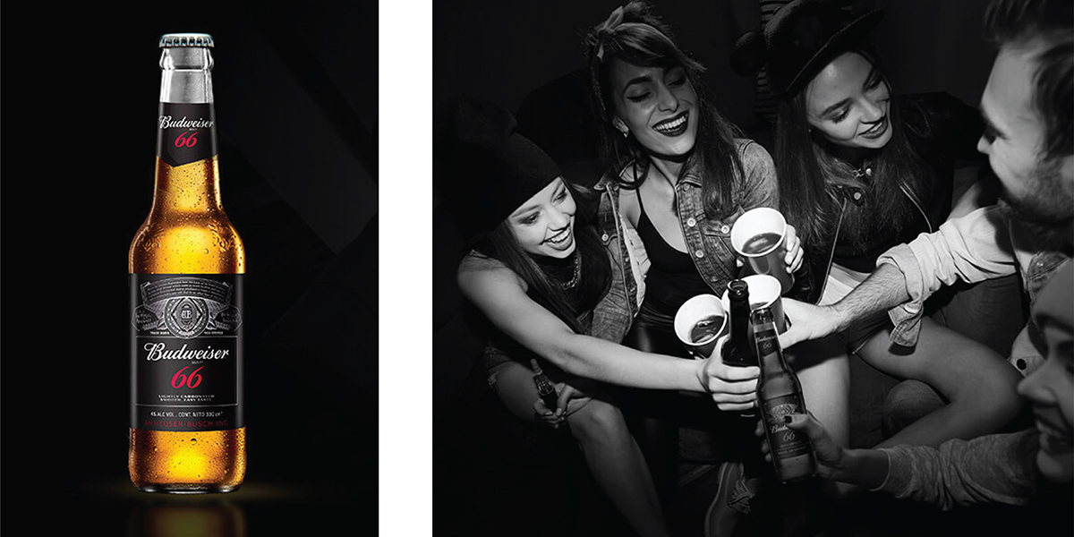
Bud 66 is the best selling premium beer in Paraguay and they needed to follow its young changing target. They decided to speak modernly and louder in their main touch point with the consumer: their packaging.
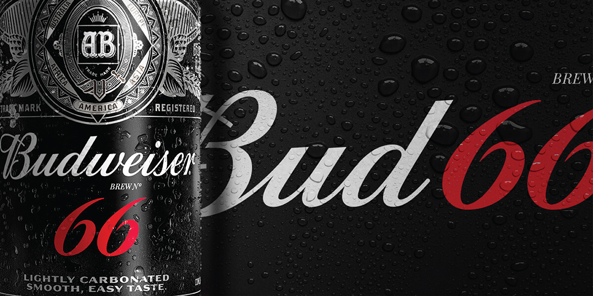
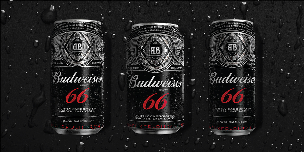
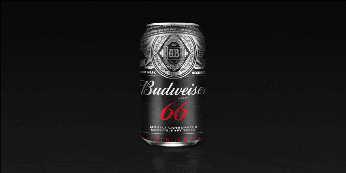
Taking into account their new visual brand identity, the Packaging Team of Bridger Conway had designed a new pack, without loosing the brand’s heritage. The new image evolved into a more minimalistic look where the brand stands out with their identity colors (black, grey and red). Maximizing their icons and cropping the brand, Bud 66 achieved a modern style.
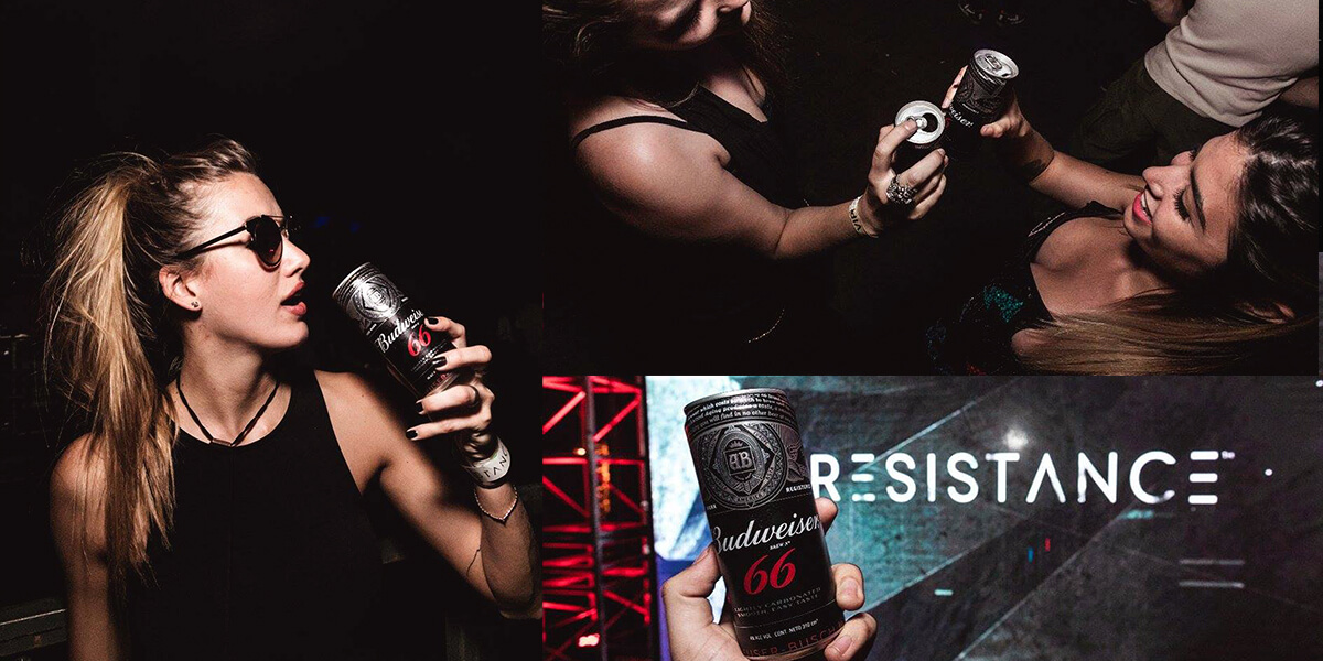
The Communication and Advertising team of the agency thought the launching strategy. Through social media, a teaser was created to reveal once a week a piece of the new design. The new pack was launched through clever magazine prints with removable black paper tab with the new hidden image with a call to action: “Explore what’s new”.
Relevant artists and influencers received the new can wrapped in paper ready to unveil the new image. In the official opening party, the host announced the new label by tearing the paper with the old image, in order to reveal a screen with the new image.
Client
AB InBev Paraguay
Discipline
Country
Paraguay